Cause-Effect Diagram
A cause-effect diagram is a visual tool designed to help you explore and identify possible causes for a problem or an observed phenomenon. This helps you to come up with possible root causes for the problem you observed, that you can then use to build experiments around.
Use this tool when:
- you want to discover customer problems
- you want to explore customer needs
- you want to discover new assumptions and hypotheses to test
Overview
| Time | ± 45 minutes | |
| Difficulty | 4 / 5 | |
| People | 3 - 5 | |
| Author | erik van der pluijm | |
| License | CC BY SA 4.0 |
What is it and when should I use it?
When innovating, it is important to find the right problems to solve, be it for your own startup, or a customer’s problem. That often involves digging deeper below the surface to uncover the real reason the problem occurs. If you know that, you can solve the problem in a more meaningful way.
Is your startup suffering from low retention? Then this tool may help you to come up with reasons this is happening.
Did you observe that customers can’t complete their Job to be Done with satisfaction? This tool can help you to come up with potential causes to validate with your customers.
A cause-effect diagram is a visual tool designed to help you explore and identify possible causes for a problem or an observed phenomenon. This helps you to come up with possible root causes for the problem you observed, that you can then use to build experiments around.
The cause-effect diagram visualizes the complex reasons a problem might occur visually so it is easy to understand and discuss with your team.
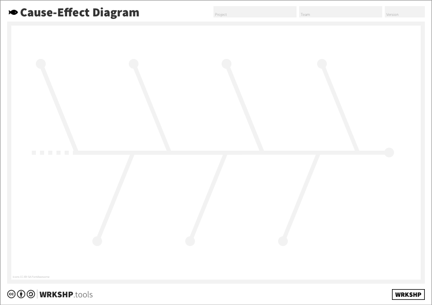
Tool Overview
Effect The observed effect or problem that you want to investigate.
Major Cause The ‘major causes’ define groups of potential causes that together produce the
Cause Each major cause is split up into several contributing potential causes.
Underlying cause Each cause is split into smaller potential underlying causes contributing to it.
Steps
1 Define the effect
Start by defining the problem or effect you want to investigate. What is it? Use a few sticky notes to define what it is, and what it is not. When does it occur? Who is affected? How does the problem manifest? Try to be specific. Then, try to ‘label’ the small cloud of stickies that you used to define the problem with one word or short sentence. Stick the label of the main effect on the canvas. Alternatively, you can use a blank section of wall and (paper) tape to create the horizontal line.
2 Brainstorm major causes
Now that the effect has been identified, it’s time to define the major causes. The main goal of this step is to identify the main areas causes could come from, as a basis for a more detailed examination in the next step.
Start by looking at the effect sticky. Ask the participants to come up with the main constituent parts of the effect.
For example, let’s say you want to investigate an effect you observed on your subscription service, which you labeled ‘low customer retention’. Try to brainstorm the building blocks for that effect.
For this ‘low retention’ example, there could be several causes. We want to find the major groups of causes.
Ask team members to brainstorm for 5 minutes individually, coming up with reasons for this low retention, looking at this from a customer’s perspective. Prompt them to think about reasons the situation might occur, no matter how far-fetched.
They might come up with reasons such as:
- Customer thinks the service is too expensive
- Customer does not see the value
- Customer forgets to renew
- Customer did not see the renewal email
- Customer’s credit card was declined
- ...
Put each of these answers on a sticky note, and cluster them by themes you spot in the stickies. This will give you your major causes. In the example, labels could be:
- Conscious decision: the customer thinks it’s too expensive, or doesn’t bring enough value.
- Accidental decision: the customer forgets to renew, did not receive the renewal email.
- Process problem: the customer wants to renew, but the payment fails.
- ...
Try to come up with 3-5 major causes. Place your major causes on the end of the branches of the cause-effect diagram. Finding major causes and clustering will help you to come up with more potential causes in the next steps. Look at the Customer Journey or the Job Map to find more potential causes.
3 Brainstorm underlying causes
Next, for each of your major causes, try to come up with more underlying causes. Look for 3-5 causes per group minimum, but 5-10 is better. It may help to look at the causes you found already, and again ask ‘why might this occur?’.
In our example, the cause ‘Customer’s credit card was declined’ for instance, might simply be because there was no money on the card, but, with some extra thought, it is clear that it also could occur for other reasons, such as:
- Customer changed their bank account
- Credit card was expired
- Customer’s address was changed
- Problem with the payment provider
- ...
Some of these might give you ideas for solutions (what if you send an ‘update your credit card information’ email if a card gets close to its expiry date?), or they might warrant some research or experimentation.
Keep asking ‘why?’ for the causes you find, until you have gone two or three steps deep. Sometimes, while coming up with new causes, you may identify a new ‘major cause’ or higher level cause. If that is the case, add these to the diagram.
Timebox this step, taking no more than 30 (or, ideally, 2x15) minutes. Try to spend an equal amount of time for each of the major causes.
4 Prioritize causes
When going through the previous steps, it is quite normal to end up with a lot of potential causes. Not all of these will be as probable, or as important. To declutter the diagram, try to prioritize these causes.
The best way to do this is to get actual data on the probability of these causes occurring. In the ‘retention’ example above, analytics data may already give you a clear idea of how many customers had their payment rejected, and how many did not open the renewal email.
In many cases, though, the data you need won’t be available. In the example, you will probably not know how many customers consciously chose not to renew, or if they did that because of the price or because of a lack of value. In these cases, try to estimate the impact this cause may have on the end result. Do you think it could be a major contributor? Or something that happens rarely?
Clearly mark the causes and sub-causes that you think are most important. Or, make a copy or photograph of your diagram and remove the causes that are not as important. You’ll end up with a prioritized diagram, that will tell you which (major) causes you currently think could be contributing to the effect you observed.
5 Check your work
Next, take a step back, and go over your diagram. Are there any major causes that have substantially fewer causes than others? Are your descriptions clear and concrete? Are there causal chains that are much shorter or longer than the others? If this happens, make sure that your diagram looks like this for the right reasons, and not because you forgot to work on part of the diagram. Be critical. Is this really complete? Can you come up with any major causes you missed?
- [] Prioritized causes and their causal chains make sense
- [] Prioritized causes are backed up by evidence
- [] No (obvious) major causes or causal chains missing
5 Next Steps
Now that your cause-effect diagram is complete, you can start putting it to good use.
If you have sufficient evidence that points to clear causes to your problem, start coming up with possible solutions. Use the Pareto (80/20) rule: probably, 80% of your problem comes from 20% of your causes.
If you have missing data that prevents you from determining which of the causal chains is contributing the most, define experiments to help you find out if the causes you came up with actually exist and how important they are.